Photography Plan
Wednesday, 21 October 2015
Monday, 19 October 2015
PLANNING Page Layout Plan
Page Layout Plan
Cover
When I do the final draft of the Cover page the font of main coverlines will be much bigger and will fill the white space in my sketch.
Contents
I am happy with the layout of my contents page.
Feature Article
On the final draft I will make the overall look of both pages more colourful to suit the artist.
Friday, 16 October 2015
PLANNING Other Artists Appearing in my Magazine
Other Artists Appearing in my Magazine
3 New Artists:
1) 2)
Artist 1:
A folk jazz band with a lead female singer aged 27 and male musicians age ranged between 30 and 35. Quite popular socilally and are called The Cymbals.
Artist 2:
A old soulful jazz female singer. Popular to older people more than young and is slow dying out of the business. Her name is Sheryl Wilson aged 55.
PLANNING Feature Artist Development and Ideas
Thursday, 15 October 2015
PLANNING My Magazines House Style
My Magazines House Style
What I noticed from my research:
- Most people prefer a gender neutral looking house style.
- The most preferred house style for music magazines was Q's because of its simplicity and gender neutral colours.
- It will be gender neutral in it's colour scheme and title font choice. It's house style colour scheme will be mainly black, white, blue and mustard.
- The font will be a simple bubble writing to make sure that it is clear to read and gender neutral.
- Subtitles and and page borders will be very much in the style of Q magazine but just in the colour scheme chosen.


PLANNING Masthead Design
Masthead Design
3 Font Designs for my Magazine Title:
1)
Which One is The Favorite?
The favorite font chosen was Font 1. However I personally cant decide between font 1 and font 3. I won't be able to decide which one to use until I have an idea of the final look of the cover and my house style.
Wednesday, 14 October 2015
PLANNING Magazine Names
Magazine Idea Generator
5 Ideas for Magazine names:
- Folkal
- Outline
- Vinyl +
- Funkel
- Woodside
End result:
My magazine will be called Folkal, this works well as the magazines genre of music will be based around folk music and the word Folkal sounds like the word vocal.
Tuesday, 13 October 2015
PLANNING My Magazines Readership Profile
My Magazines Readership Profile
Basic Reader Information:
- Age: Ranges between 14 and 30, adolescent years all the way through young adulthood.
- Gender: Aimed at Female and Male using colour schemes and images very gender neutral.
- Occupation/Skills: The older readers will have very creative, stress free jobs e.g: artist, architect or in performing arts. Younger readers will have a very creative skills set and will want to pursue a creative life and career.
- Demographic: Level B/A so quite high status, people buying this magazine will need to be quite well payed to get the magazine and then maybe purchase music advertised within it.
An Example of one of my Readers!
This is Patrick in a nut shell:
Age: 17
Gender: Male
Occupation: Student studying Media, Drama and Business
Demographic: Level B
Personality and Characteristics:
- Interested in old sounding music made to sound modern and up to date. for examples genres of music like folk rock, indie pop and indie rock.- Interested in performing arts in general, dance, drama and music.
- In to helping with the local area and helping with charities.
- Loves to party and socialize with friends and cool modern events e.g: festivals
- Interested in vintage clothes and would regularly shop online on Etsy or go to charity shop to buy clothes.
- Personality:
 - Out going character with a bubbly personality but at the same time a cool calm way about themselves.
- Popular in social groups.
- Loves to lead but doesn't push themselves into situations.
- Psychographics:
In their spare time?

- Plays guitar
- Attends a drama club
- listens to music and composes
- In holidays helps out at local charity centres
- volunteer work
- Art
- Goes for walks in woods, fields and parks

What They spend money on?
Media Consumption:
- Reads some music magazines like Q and NME
- Uses social media like Facebook, Pinterest, Instagram and Twitter
- Shops on websites like Etsy, Fab.com, fat face, new look, urban outfitters
- Watches TV and films and watches genres like dramas, comedy and sometimes action.
Monday, 12 October 2015
PLANNING Initial Ideas
Initial Ideas
Idea 1:
Genre: Rock, Folk, indie
Readership: Male and Female audience, calmed chilled teens aged between 13 to 30
Existing artist examples: Mumford and sons, Simon and Garfunkel
Colour theme: browns, golds, yellows, burgundy, grey
This idea would be nice to work with as the colours and themes that would need to be within a photo of my artist would be quite naturalistic and would be great to use my surrounding environments e.g: fields or woods. This style can appeal to a wide range of ages which will give my magazine more readers.
This idea would be nice to work with as the colours and themes that would need to be within a photo of my artist would be quite naturalistic and would be great to use my surrounding environments e.g: fields or woods. This style can appeal to a wide range of ages which will give my magazine more readers.


Genre: Folk, Folk indie, pop indie, rock indie
Readership: Female, teen to young adult 12 to 25
Existing artist example: Birdy, Two Door Cinema Club
Colour theme: Green, purple, gold, yellow, brown, dark pinks
This style is very must more based around and younger audience of adult and even towards teens. This means I can be more playful with my page designs and colour scheme and not keep it plan and simple like and newspaper. As the audience is younger it would be a good idea to use a young person as my main artist in my feature article so the reader can relate more with the magazine and artist.


This style is very must more based around and younger audience of adult and even towards teens. This means I can be more playful with my page designs and colour scheme and not keep it plan and simple like and newspaper. As the audience is younger it would be a good idea to use a young person as my main artist in my feature article so the reader can relate more with the magazine and artist.

Idea 3:
Genre: Alternative dance, Indie pop, Electronic rock
Readership: Mainly male based, ages 15 to 30
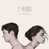
Existing artist example: Coleman Hell
Colour theme: Electric colours, red, purple, pink blue
As this style is much more energetic an electric and its sound and look and can incorporate this look throughout the article and cover to get across to the audiences my artists energy and style. This artist will be crazy in look but subtle in personality so the look to covers and photos don't have to be to overwhelming.
As this style is much more energetic an electric and its sound and look and can incorporate this look throughout the article and cover to get across to the audiences my artists energy and style. This artist will be crazy in look but subtle in personality so the look to covers and photos don't have to be to overwhelming.

RESEARCH Analysis of Audience Research
Analysis of Audience Research
Results from questionnaire and analysis:
My results show that people mainly read music magazines to find out about new artist. This does not surprise me as I personally would read a music magazine for this reason and not really to find out about events or artists I already know about.
This research shows us that Q magazine has the most appealing look and house style and that most people would prefer that magazine because of it. The magazines house style is very gender natural so I'm not surprised that most of the 20 people who took the questionnaire when this way.
My results show that the majority of magazine readers would prefer a tidy front cover layout so that the overall message is clear and so that it is clear and easy to understand and not messy and confused.
The colour scheme shown to be the most popular in my results is not surprising as the colours chosen are quite gender natural where as the other 3 options are either more liked my one sex, for example pink and lighter colours would be favored by females and the blues and darker colours would more or less be favored by the males.
The genres chosen to me the most liked where the more up to date more modern styles of music, rock and pop. This is the case as on most social media and radio stations this genre of music is played meaning that it is the most listened to genre and preferred out of the 5 shown above.
The font style Serif Sans is generally more popular to use in magazines as the font is generally clearer and easier to read and understand. This also means that the font drags less attention away from the rest of the page with is interesting colours and picture.
Subscribe to:
Comments (Atom)


 3)
3) 4)
4)


